AlphaVantage were founded in 2017 following the demise of the Yahoo Finance API. They offer OHLC data on 100,000+ securities, ETFs and mutual funds. Along with Forex, Crypto and Fundamental data, all accessible via their REST API. They offer free or premium membership which depend on the number API calls you require. Their premium packages range from 49.99 to $249.99 a month. While most of their data is freely accessible with API limitations of 5 calls per minute, in recent years some datasets have started to be classed as premium. The datasets which are considered as premium are variable and also subject to change over time. For example, in 2022 daily adjusted end of day(EOD) equities data was made premium. Yet in 2023, this is once again freely available and daily unadjusted EOD data is now premium. Intraday forex and Intraday crypto are also currently premium.
By default AlphaVantage API calls download the last 100 data points but you can download all of the available historic data by specifying outputsize=full. You can filter by a date range post download. AlphaVantage provide 20+ Years stock data, Forex and Crypto histories appear to have variable lenghts with USD:GBP going back to 2003 and USD:BTC covering the last 3 years. They also offer 5 years of fundamental data.
In this tutorial we will be looking at how to access data from the AlphaVantage API and how to get that data into a Pandas DataFrame for further analysis. We will then be creating a multichart candlestick subplot using the Plotly library.
This tutorial forms part of our early career researcher series where we set up a research prototyping environment with Jupyter Notebook.
If you do not have this environment set up and would like to follow along you will need:
- Python 3.8
- Pandas 1.4
- Plotly 5.6
- Requests 2.27
AlphaVantage API
In order to use AlphaVantage you will need to sign up to their free (or premium) membership and obtain an API key. Once you have your key you can begin to download data from their API using a get request. We begin by importing the necessary libraries; requests - to make or API call and Pandas - to create a DataFrame for our downlaoded time series data.
import pandas as pd
import requests
We create our get request using the requests library and add in our API key to the URL. In this case we are requesting the daily adjusted OHLCV data (function=TIME_SERIES_DAILY_ADJUSTED) for AAPL (symbol=AAPL) and we have requested the full historical data (outputsize=full). We save the JSON output to a variable av_json by calling the Python built-in JSON method. Remember to add your API key to the end of the request statement (apikey=YOUR_API_KEY).
av_response = requests.get('https://www.alphavantage.co/query?function=TIME_SERIES_DAILY_ADJUSTED&symbol=AAPL&outputsize=full&apikey=YOUR_API_KEY')
av_json = av_response.json()
You can see what has been returned from the API call by simply printing the av_json variable print(av_json).
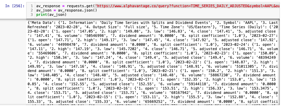
JSON has become one of the most popular ways to transfer data from APIs however, it is not fully standardised. Data is most commonly transferred as a list of dictionaries, but there are always exceptions to this. In the case of AlphaVantage our API call has returned nested dictionaries. The av_json variable is a dictionary of dictionaries (of dictionaries!). This pattern is reasonibly common, so it's worth taking some time to understand where our data is stored so that we can work out how to access it.
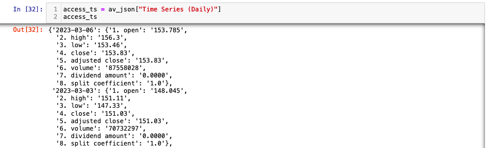
The outer dictionary has two keys; Meta Data and Time Series (Daily). The values of both these keys are also dictionaries. The first key value pair is meta data for the download, the second is the time series data. The data we need to access is located in the value of the second key:value pair. This is also a dictionary where the keys are the dates and the values are another dictionary containing the OHLCV data points. Our data is stored in a dictionary three levels deep. We can access the time series dictionary using the Time Series (Daily) key.
access_ts = av_json["Time Series (Daily)"]
access_ts
This produces a dictionary where the values are a time series dictionaries.
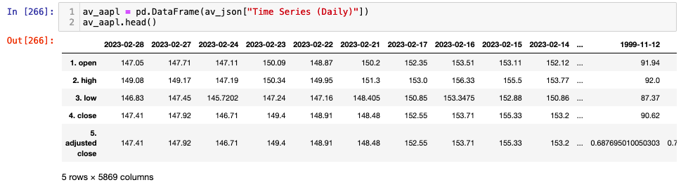
Fortunately for us Pandas has a number of methods which can simplify the process of getting the data into a DataFrame for further analysis. As demonstrated above we can access the time series data by using the key "Time Series (Daily)". Putting this into the pd.DataFrame method gives us a DataFrame with dates as columns and OHLCV data as rows.
av_aapl = pd.DataFrame(av_json["Time Series (Daily)"])
av_aapl.head()
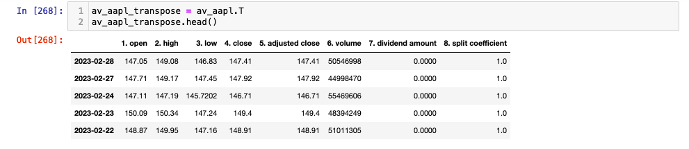
We can transpose this data such that our columns and rows swap using the DataFrame.transpose method. As repeated calls to transpose flip the data back and forth it is always good to create a new variable and run the code in an independent cell (if using Jupyter notebook).
av_aapl_transpose = av_aapl.T
av_aapl_transpose.head()
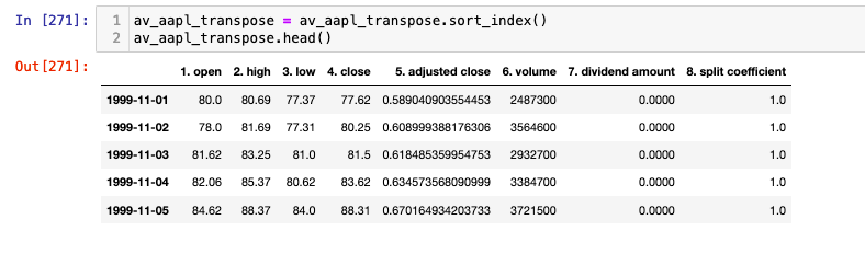
Now we can make sure our index is a datetime object.
av_aapl_transpose.index = pd.to_datetime(av_aapl_transpose.index)
And we can sort our index so that it is in ascending order
av_aapl_transpose = av_aapl_transpose.sort_index()
AlphaVantage CSV Reading
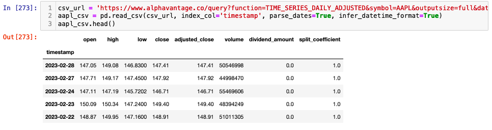
In addition to the JSON format we can also download CSV files from AlphaVantage and read them into a Pandas DataFrame directly. Here the pd.read_csv method also assigns the index column and parses dates directly minimising extra coding work to format the data. Remember to add your API key to the end of the request statement (apikey=YOUR_API_KEY).
csv_url = 'https://www.alphavantage.co/query?function=TIME_SERIES_DAILY_ADJUSTED&symbol=AAPL&outputsize=full&datatype=csv&apikey=av_key'
aapl_csv = pd.read_csv(csv_url, index_col='timestamp', parse_dates=True, infer_datetime_format=True)
aapl_csv.head()
Now that we have looked at how to get a single stock into a DataFrame for more analysis. let's extend the method to look at multiple stocks. In the example below we are accessing the full historical data available from AlphaVantage for 5 ETFs. Bear in mind that for free tier users your API calls are limited to 5 per minute. As such you need to make sure your API call is stored as a variable and placed in it's own cell if using Jupyter notebook. That way you can extract the data and do your analysis without repeatedly calling the API.
Sector ETF Multi Candlestick Chart
First we create a list of tickers we want to analyse. If you are unsure of the ticker for your stock you can use symbol search API end point. Bear in mind that this will use one of your API calls!
etf_symbols_list = ['SPY', 'XLF', 'XLE', 'XLU', 'XLP']
We will store our data in a dictionary where the keys are the stock tickers and the values are our OHLCV DataFrames. Remember to add your API key to the end of the request statement (apikey=YOUR_API_KEY).
etf_data = {}
for symbol in etf_symbols_list:
    url = f'https://www.alphavantage.co/query?function=TIME_SERIES_DAILY_ADJUSTED&symbol={symbol}&outputsize=full&datatype=csv&apikey=YOUR_API_KEY'
    etf_data[symbol] = pd.read_csv(url, index_col='timestamp', parse_dates=True, infer_datetime_format=True)
Now we can loop through the keys in our dictionary to perform any further formatting actions on our DataFrames. In this case we will sort the index and also add a moving average column. This is discussed further in our article creating an algorithmic trading prototyping environment.
for etf in etf_data.keys():
    etf_data[etf] = etf_data[etf].sort_index()
    etf_data[etf]['MA5'] = etf_data[etf]['adjusted_close'].rolling(5).mean()
Now we will discuss how to create a multichart figure that displays the OHLC data as candlesticks for each of our five ETFs. For this we will be using the Plotly library as we have done in previous articles but we will be extending the plotting to include subfigures. As we have downloaded the full history from AlphaVantage the first step is to create a mask to filter the data to our desired data range. We create a new dictionary of DataFrames so that our underlying full history is still accessible. We will be using the datetime library.
from datetime import datetime as dt

start = dt(2023, 1, 24)
end = dt(2023, 2, 24)
etf_data_mask = {}

for etf in etf_data.keys():
    mask = (etf_data[etf].index >= start) & (etf_data[etf].index <= end)
    etf_data_mask[etf] = etf_data[etf].loc[mask]
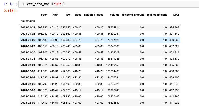
We can look at the filtered data for each ticker as follows:
etf_data_mask['SPY']
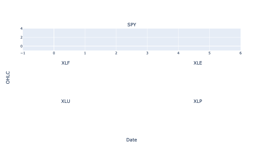
We can now begin creating our ETF multichart subplot. We have data for SPY the ETF for the S&P500 and four other sector ETFs. This example is overtly contrived to demonstrate some of the more technical aspects of plotting with Plotly. We are going to create a mulitchart candlestick figure where the SPY OHCLV chart is larger, spanning a single row (both columns) of the subplot. The other four ETFs will be displayed across a single column on each row.
In order to create the candlestick subplots we will be using Plotly graph objects and subplots libraries. We begin by importing the libraries. Then we define our subplot specification. The Plotly documentation has so great examples of working with Subplots here.
The make_subplots class allows us to specify the shape of our subplot using the keyword arguments rows and cols. We need 3 rows and 2 columns. To ensure the first figure is larger we can use the specs keyword. This allows you to define certain parameters for each subplot using a dictionary. The specs keyword argument is an array with the same dimensions as your subplot. As we are using 3 rows and 2 columns our empty array will look as follows:
  specs = [[{}, {}],
         [{}, {}],
         [{}, {}]]
The dictionary at each subplot position allows you to specify colspan for each of the plots. As the default value is 1 we need only specify the colspan for the first subplot. We also set the second column of the first row to be None so that no chart is displayed. As we also want to show the volume on the same chart as the candlesticks, we set the value of secondary_y to True.
The make_subplots function also has the keyword subplot_titles allowing us to set a title for each of our subplots. Here we pass the etf_symbols_list we created when downloading our data. We can also set titles for our x and y axes. We begin by importing make_subplots and plotly.graph_objects
from plotly.subplots import make_subplots
import plotly.graph_objects as go

fig = make_subplots(
    rows=3, cols=2,
    specs=[[{"colspan": 2, 'secondary_y': True}, None],
           [{'secondary_y': True}, {'secondary_y': True},],
           [{'secondary_y': True}, {'secondary_y': True},]],
    subplot_titles=(etf_symbols_list),
    x_title="Date",
    y_title="OHLC"
)
fig.show()
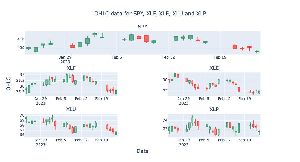
Rather than using the etf_symbols_list as an iterable we create a new plot_symbols interable with six elements. Even though we are plotting five ETFs there are technically still six subplots. We need to adjust the iterable to have six elements to ensure that the subplot at the first position does not display data for two ETFs. We also need to account for this when we define the row and col position.
We enumerate through the plot_symbols iterable in order to define the row and column integer. This is a common pattern for defining the position of subplots so it is worth understanding. Where subplots are plotted from left to right across columns, subplot assignment follows a pattern where the row number repeats n times, where n the number of columns. In our case row number for each plot is 1,1,2,2,3,3. This pattern can be achieved by carrying out integer division. i // num_cols gives the desired zero indexed row number for each subplot. For columns the pattern is the repeating sequence of column numbers, in our case 1,2,1,2,1,2. This can be achieved using the modulo operator. i % num_rows gives the zero indexed column position.
As plotly is not zero-indexed we simply need to add 1 to the calculation to get the correct value for rows and columns. To accomodate our larger subfigure we also use an if statement to make row and col equal to 1 on the second iteration of the loop. Now we can add each Candlestick trace in a loop with correctly defined positions. Finally we use fig.update_layout to remove the legend, set the text and position of the title and turn off the rangeslider.
from plotly.subplots import make_subplots
import plotly.graph_objects as go

fig = make_subplots(
    rows=3, cols=2,
    specs=[[{"colspan": 2, 'secondary_y': True}, None],
           [{'secondary_y': True}, {'secondary_y': True}],
           [{'secondary_y': True}, {'secondary_y': True}]],
    subplot_titles=(etf_symbols_list),
    x_title="Date",
    y_title="OHLC"
)

plot_symbols = ['SPY', 'SPY', 'XLF', 'XLE', 'XLU', 'XLP']

for i, etf in enumerate(plot_symbols):
    if i == 1:
        row = 1
        col = 1
    else:
        row = (i//2)+1
        col = (i%2)+1

    fig.add_trace(
        go.Candlestick(
            x=etf_data_mask[etf].index,
            open=etf_data_mask[etf]['open'],
            high=etf_data_mask[etf]['high'],
            low=etf_data_mask[etf]['low'],
            close=etf_data_mask[etf]['adjusted_close'],
            name="OHLC"
        ),
        row=row, col=col
    )
    fig.update_layout(
        showlegend=False,
        title_text="OHLC data for SPY, XLF, XLE, XLU and XLP",
        title_xref="paper",
        title_x=0.5,
        title_xanchor="center")
    fig.update_xaxes(rangeslider_visible=False)
fig.show()
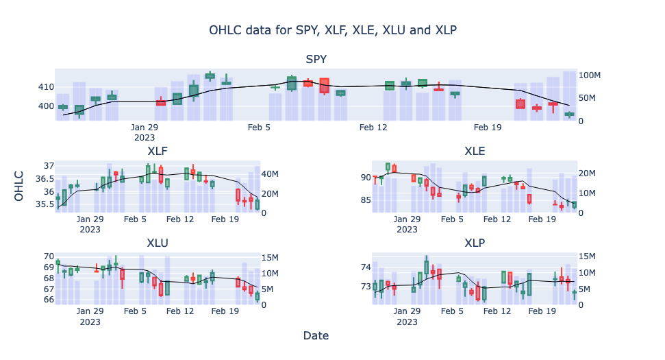
That's most of the hard work done. All that remains is to add the Volume to each chart with a secondary y axis and a scatter plot for our moving average.
from plotly.subplots import make_subplots
import plotly.graph_objects as go

fig = make_subplots(
    rows=3, cols=2,
    specs=[[{"colspan": 2, 'secondary_y': True}, None],
           [{'secondary_y': True}, {'secondary_y': True}],
           [{'secondary_y': True}, {'secondary_y': True}]],
    subplot_titles=(etf_symbols_list),
    x_title="Date",
    y_title="OHLC"
)

plot_symbols = ['SPY', 'SPY', 'XLF', 'XLE', 'XLU', 'XLP']

for i, etf in enumerate(plot_symbols):
    if i == 1:
        row = 1
        col = 1
    else:
        row = (i//2)+1
        col = (i%2)+1

    fig.add_trace(
        go.Candlestick(
            x=etf_data_mask[etf].index,
            open=etf_data_mask[etf]['open'],
            high=etf_data_mask[etf]['high'],
            low=etf_data_mask[etf]['low'],
            close=etf_data_mask[etf]['adjusted_close'],
            name="OHLC"
        ),
        row=row, col=col
    )
    fig.add_trace(
        go.Bar(
            x=etf_data_mask[etf].index,
            y=etf_data_mask[etf]['volume'],
            opacity=0.1,
            marker_color='blue',
            name="volume"
        ),
        row=row, col=col, secondary_y=True,
    )
    fig.add_trace(
        go.Scatter(
            x=etf_data_mask[etf].index,
            y=etf_data_mask[etf].MA5,
            line=dict(color='black', width=1),
            name="5 day MA",
            yaxis="y2"
        ),
        row=row, col=col, secondary_y=False,
    )
    fig.layout.yaxis2.showgrid=False
    fig.update_layout(
        showlegend=False,
        title_text="OHLC data for SPY, XLF, XLE, XLU and XLP",
        title_xref="paper",
        title_x=0.5,
        title_xanchor="center")
    fig.update_xaxes(rangeslider_visible=False)
fig.show()
Hopefully this tutorial has given you a good overview of accessing AlphaVantage data using the API and creating some more complex plots using Plotly. For completeness we will now look at some of the other data that can be obtained from AlphaVantage and how to transform the data into DataFrames for further analysis.
AlphaVantage Forex Data
AlphaVantage offer OHLC data for 157 physical currencies. On a premium membership OHLC data can be obtained on Intraday (1min, 5min, 15min, 30min and 60min) frequencies. Free users can download daily, weekly and monthly data. The full output size returns the last 5000 time points (candles or bars) from the time series. AlphaVantage do not currently offer quote data (bid and ask price) but they do offer data on exchange rates.
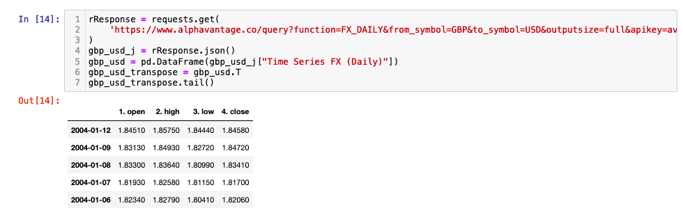
Below you will find an example API call to obtain the full historical OHLC data for the daily GBP:USD time series. Remember to add your API key to the end of the request statement (apikey=YOUR_API_KEY).
rResponse = requests.get(
    'https://www.alphavantage.co/query?function=FX_DAILY&from_symbol=GBP&to_symbol=USD&outputsize=full&apikey=YOUR_API_KEY'
)
gbp_usd_j = rResponse.json()
gbp_usd = pd.DataFrame(gbp_usd_j["Time Series FX (Daily)"])
gbp_usd_transpose = gbp_usd.T
gbp_usd_transpose.tail()
AlphaVantage Crytocurrencies Data
Alphavantage offer data on 575 digital currencies, across all physical currencies. The data is similar to that already discussed for Forex. Premium users can access intraday OHLC data which also includes volume. Free users can access daily, weekly and monthly data. The full output size for digital currencies is 1000 data time points in the time series.
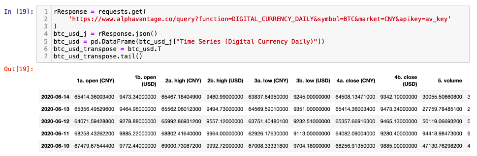
An example API call for Bitcoin(BTC) and Chinese Yuan(CNY) can be seen below. Notice that you are also provided with the USD OHLCV data.
rResponse = requests.get(
    'https://www.alphavantage.co/query?function=DIGITAL_CURRENCY_DAILY&symbol=BTC&market=CNY&apikey=YOUR_API_KEY'
)
btc_usd_j = rResponse.json()
btc_usd = pd.DataFrame(btc_usd_j["Time Series (Digital Currency Daily)"])
btc_usd_transpose = btc_usd.T
btc_usd_transpose.tail()
AlphaVantage Fundamental Data
AlphaVantage also offer fundamental data over a variety of time intervals. This includes information on company delisiting. Delisting information is very important for backtesting. In order to run a historical backtest of a strategy across an index and ensure accurate results you need to represent the correct companies in the index through out the time period your backtest covers.
If you were to run a 20 year backtest across the current stocks in the S&P500 you would get a very favourable outcome. Not because your trading strategy is awesome but because you have introduced survivorship bias. The companies currently in the S&P500 are not the same as they were 20 years ago. The S&P500 is a list of the top 500 companies. Your strategy is being executed on companies that have grown over the course of the last 20 years. This information would not have been available 20 years ago. Your strategy should execute on data from the companies that were in the S&P500 at any point in time.
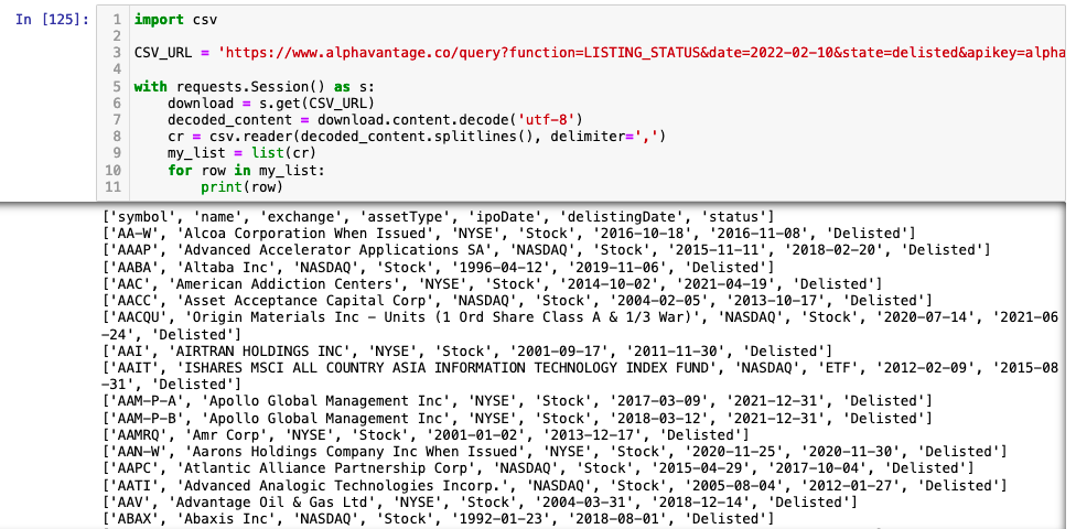
Below we show how you can access the delisted CSV data.
import csv

CSV_URL = 'https://www.alphavantage.co/query?function=LISTING_STATUS&date=2022-02-10&state=delisted&apikey=YOUR_API_KEY'

with requests.Session() as s:
    download = s.get(CSV_URL)
    decoded_content = download.content.decode('utf-8')
    cr = csv.reader(decoded_content.splitlines(), delimiter=',')
    my_list = list(cr)
    for row in my_list:
        print(row)
AlphaVantage also offer Economic and Technical indicator data as well as commodities and some sentiment analysis. All data is avaliable through their API. Access to some datasets requires a premium membership, which datasets (as discussed earlier) are subject to change. As with all free data providers it is good to use the data to get familiar with methods and prototyping. However, it is not suitable for live trading. As mentioned in earlier articles most free data vendors have terms and conditions which you from prevent this.
This concludes our tutorial on accessing AlphaVantage data in 2023. This tutorial is part of earlier career researcher series. Links to other articles in the series can be found below.